Lighting and Look Development - Devlog 4
To describe my process I have to jump back a bit to what my goals were starting out. The first step was a mood board. The board had a mix of noir movie stills, landscape prints, and paintings of the American West by Maynard Dixon, Maxfield Parish, and many others (The actual moodboard has 10 times more images but these are a few selections I like).
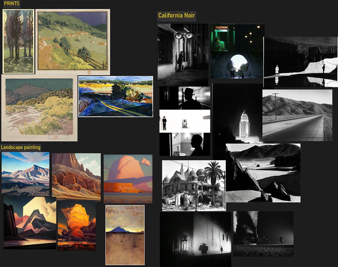
I started by thinking about how all of the images were interrelated and to pull out some attributes I could use. For example:
- Limited-color schemes
- A compressed value scale
- Vibrant shadows
- A slight ‘toothieness’ or grain in solid areas and along edges
- Increased saturation and hue variation around edges
It’s a much longer list but you get the idea. From a practical point of view leaning into a style from the start helps me stay focused on details that deliver the most impact. I wouldn't say using a ‘stylized’ art style makes for less work, but I’m able to spend more time working on tasks I care about, I'm not just trying to fill space.
On Lighting
The lighting approach for this project came about from the specific conditions of the game's setting:
Vast outdoor daytime spaces and large expanses of sunbaked dirt.
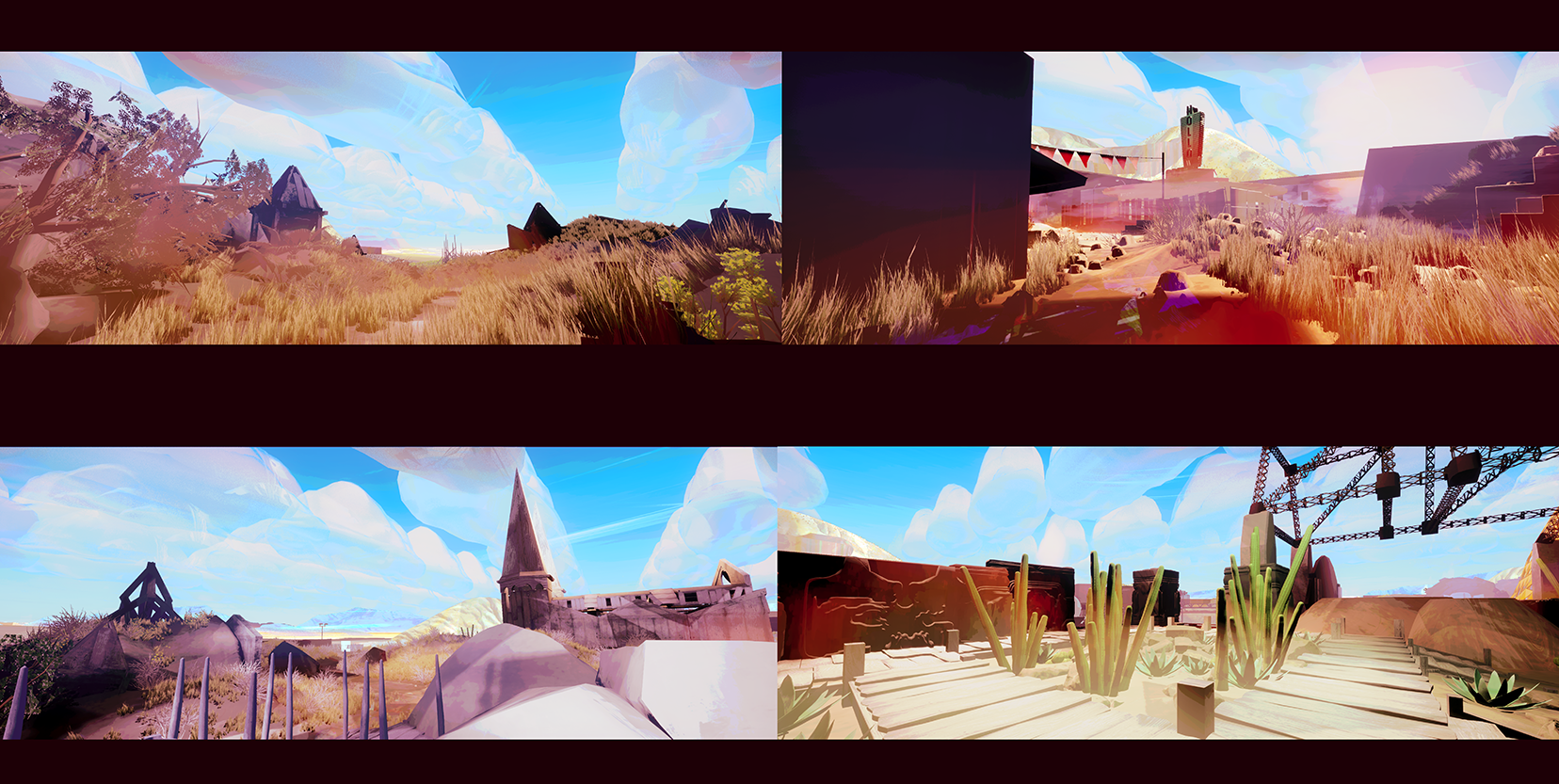
The focus is on form and color variation within large areas of the same material. I wanted lots of bounce Illumination from the dirt to get across the sterile but warm desert-y vibe. At the same time, I also wanted to be able to make areas of high contrast with low or no detail in the shadows.
Solutions like global illumination, image-based lighting, and raytracing were all eventually ruled out because they were too hard to control and costly given the large size of the level. I also ruled out directional lights at this stage since they would affect the entire level uniformly. There are technical solutions around all this, linking lights to layers or using volumes for example, but ultimately I'm going for a more hand-crafted approach, something that feels closer to painting.
My second test involved placing a bunch of point lights and reflection probes to ‘fake’ indirect lighting. I created a light function to adjust the lights’ area of effect and temperature based on height.
This broke the image into three distinct regions with specific light groups masked to each region.
A: Low-highlight-warm
B: Mid-dark-cool
C: High-midtone-warm.
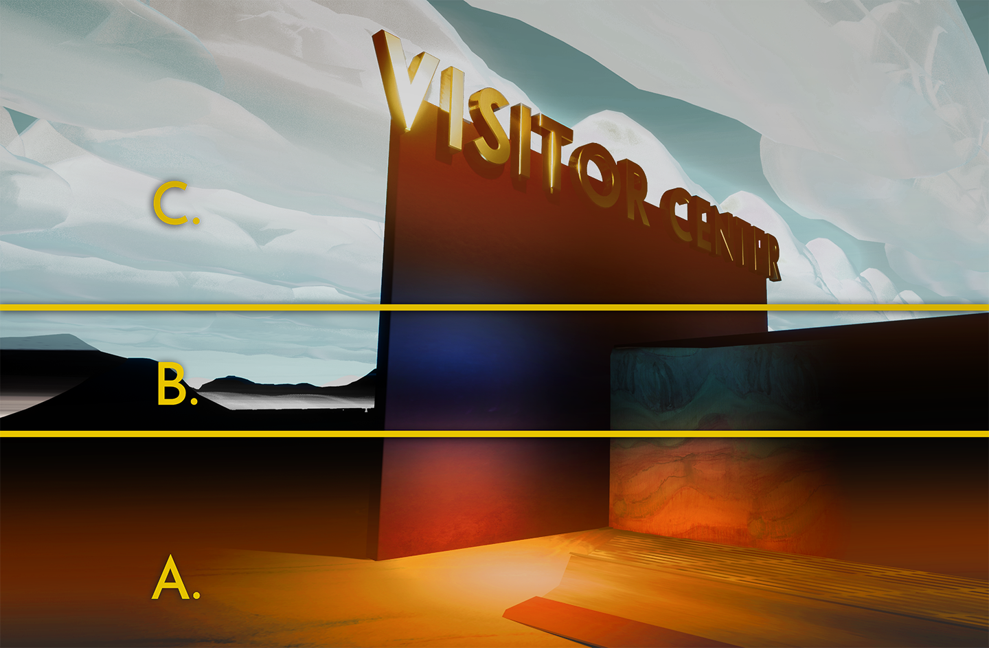
In practice, it's a lot more subtle than this, but the ability to mask lights got me thinking in more '2d illustration' terms. The background is a separate consideration that isn’t relevant yet.
This looked pretty nice with real-time lights but the performance was terrible with so many overlapping sources (I'm using Ue4 for this project). The scale of the environment made baking light maps unfeasible (or at least not worth the blotchy results or large size on-disk for high-res light maps).
Next, my experiments shifted to decals. I applied a similar height-based technique to a decal material and created additive and modulate blended versions.
The process I’ve landed on mixes both approaches. Spotlights hit key areas and decals simulate a painterly indirect light in-between. It allows me to light the environment more like a theatrical set with a clear focal point and areas outside of that fall into shadow or a second read. The player navigates the world by going between these hotspots. This lighting isn’t physically accurate, sometimes it isn’t logical, but it has a poetic coherence and the ability to put shadows anywhere gestures at some of my early noir inspirations.

On the Post-Process
If you imagine a traditional screen printing process there’s a quality to how the layers are built up which limits detail. Each subsequent layer interacts with the color and values of the one before. While figuring out how the post-process shader should be structured I often thought of printmaking and tried to emulate the mechanics of it.
The goal of the post-process is to apply a final ‘filter’ that glues everything together and adds a little extra atmosphere. In this case, it’s also responsible for resolving the background which is completely dark otherwise due to a lack of any global light source (background in this case refers to any area as defined by x-thousand Unreal units from the camera and a primary light source).
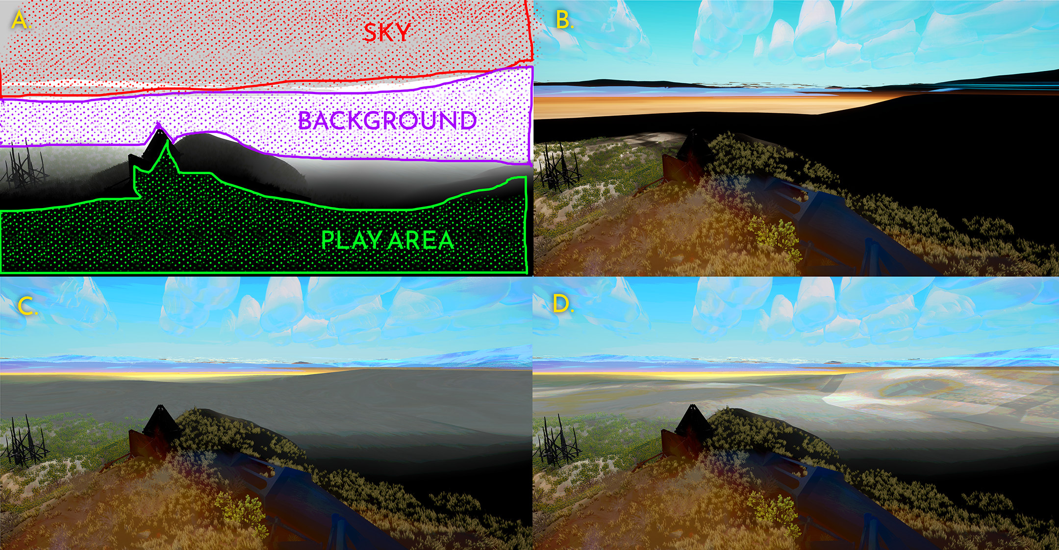
Currently, my post shader has four basic operations (see breakdown below):
A. Slices up the image by depth and height into: the play area, background, and sky so they can be manipulated independently and then are composited back together.
B. ‘posterize’ operation that clamps the color and value spectrum within a range defined by parameters. Each slice can also have its posterization dialed in separately.
C. Takes the scene’s unlit base color from the g-buffer and applies that to the background slice. There is an additional step (D.) that also happens in this pass where I'm using a world-aligned texture to stencil some highlights onto the base color. This simulates distant light dappling and helps break up some of the monotonous-looking terrain. The sky and clouds are unlit but can be color-corrected independently from the other slices.
I haven’t made a terrain shader yet so the final product will have less obvious texture tiling in the unlit slice.
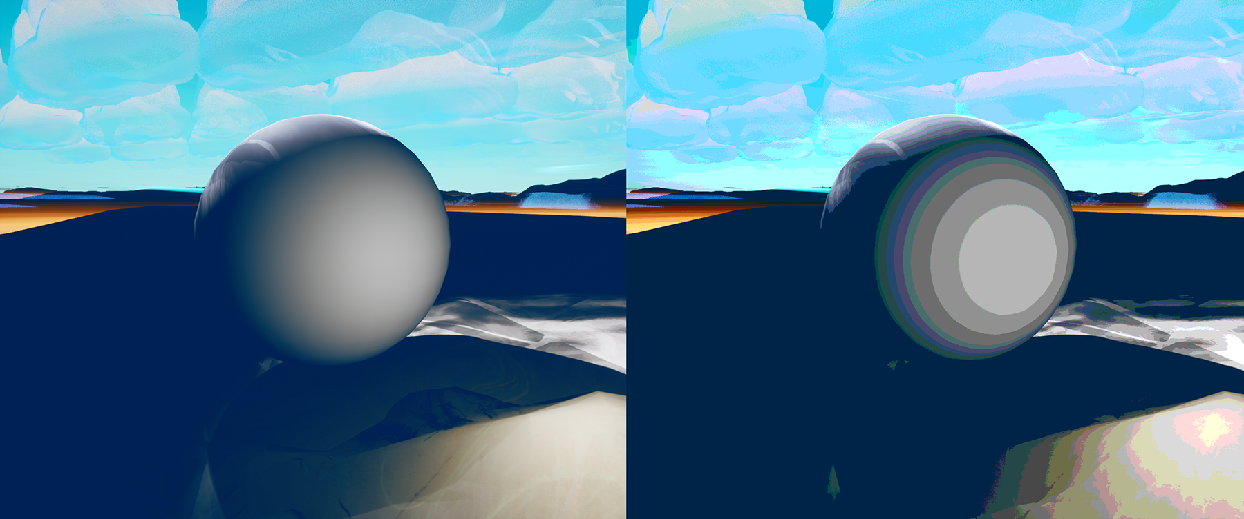
More basic color correction will be applied locally with volumes to further differentiate each area and accentuate story moments.
Hollow Hills 1999
Explore Hollow Hills National Park on the eve of the new millennium
| Status | In development |
| Author | Jacob Potterfield |
| Genre | Adventure, Visual Novel |
| Tags | 3D, First-Person, Surreal |
More posts
- On Architecture and World - Devlog 345 days ago
- On Layout and Tools - Devlog 264 days ago
- Intro Devlog79 days ago
Leave a comment
Log in with itch.io to leave a comment.